You all know that I love photo albums and sharing photo book layout tips. They’re my favorite ways to keep photos, so I’ve easily made over two dozen of them. This is why I can confidently say that I’ve perfected the art of photo album design. Trust me, in the beginning, I made my fair share of cramped and low-quality books. Now I’m picky and I invest in my photo albums and it makes a huge difference in how I enjoy them. When designing a photo album if you follow these photo book layout tips then your photo album will turn out beautifully.
1. Don’t crowd your pages.
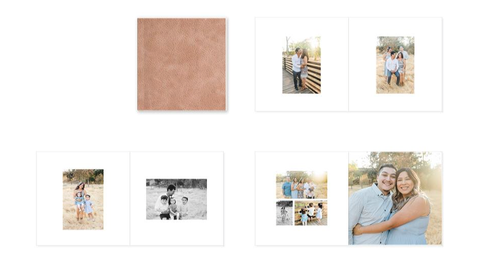
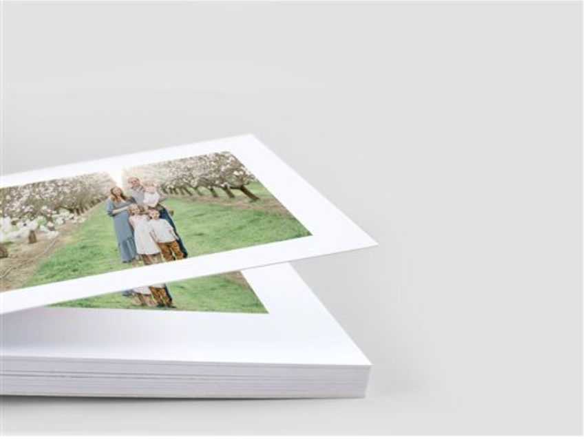
Enjoy those photos! Spread them out! I’m a big fan of full-page spreads, especially in a flat-lay album. I’ll choose a horizontal image that I love and I’ll use it across two entire pages. My rule of thumb is don’t try and put more than 5 photos on a single page. Otherwise, they get way too small and they’re harder to see. A spread is two open pages right next to each other. If I have 5 images on one page, then I try to do just 1-2 images on the other page opposite it to balance out the spread.
2. Don’t use Shutterfly.
I’m sure you’ve heard me mention this before. As tempting as Shutterfly discounts are, you’re going to be a little disappointed when your photo album arrives. In my experience, the quality is poor and I’m bummed that the photos don’t look as good as they did digitally. My number one recommendation is to go through your photographer because they can make sure that your photo quality printed is the same as what you see on your computer. If you’re not able to go through your photographer, I recommend Mpix. I think they have great quality.
3. Create variety!
Create variety with the number of photos on each page and the patterns on the pages. For example, one page has two photos and then the following page has only one. Then switch it to four photos on the next page and two photos after that. Remember my rule about a max of five photos on a single page.
Do you make your own photo albums? How do you like enjoying your photos? I hope my photo book layout tips are helpful!
TLDR: Photo Book Layout Tips
